Reading Images
This is one example of a structure you can use for analysing photographs. It is a guideline, and not designed to be applied slavishly to all images. Some don’t need all of it, and others are so obscure that it won’t help anyway; but if a picture is designed to communicate, it ought to convey at least some of its author’s intentions.
Description
I.e. ‘This is a picture of.... doing....’ etc.
A straightforward description of the picture’s content, without interpretation. Sometimes this isn’t as easy to do as it sounds; it’s hard to look at a photograph without giving it any judgement, mood or meaning.
Technical
The use of camera, lens, shutter, aperture, exposure, lighting, film, format, printing, presentation etc.
Formal
The composition and design of the photograph, the use or breaking of compositional conventions.
E.g. Angle of view, use of space, focus, background, lines, curves, tonal balance, colour range and intensity, picture format and orientation, position of subject(s) within frame, relationship of picture elements with each other.
There must be lots more as well. Not all compositional devices apply to all pictures, of course.
Emotional
This is about the emotional content, or the ‘feel’ of a picture.
We often describe an image as ‘moody’, ‘dark’, ‘sombre’, ‘disturbing’; or alternatively as ‘light’, ‘airy’, ‘humorous’, ‘peaceful’; or as ‘flat’, ‘bland’, ‘dull’ if it doesn’t give us much emotional reaction.
Judging the mood of a photograph will often be a matter of first impression, and will depend on our own mood and feelings at the time as well as the photographer’s.
Contextual
Everything we already know about the picture, the photographer and the circumstances of its making and presentation.
If we know the photographer is normally very political, we will look for that in the image. If we know the picture is part of a series, it might be read differently than if it stands alone. If it is presented next to one picture it will seem different to if it were next to another. If I tell you what I think it means, that will influence your own views. If you are English, you might see a picture differently than if you are American, or Japanese - interpretation can be cultural.
As already suggested, our own feelings and attitudes are an enormously important part of the context in which we understand images.
Meaning
This is the big one, and is a combination of all the above, plus a load of other things.
The use of text with it can influence meaning too. Text can be used to ‘anchor’ the meaning, by offering an interpretation for the viewer to pick up. Captions often do this, and we have seen examples before. It can also do the opposite, opening up ambiguities, contradictions and other interpretations. Text can offer information about things which the photograph cannot show, or persuasion towards a point of view (as in advertising and propaganda).
I have already said that if a picture is designed to communicate, it ought to convey at least some of the author’s intentions. However, if it has the subtlety of a sledgehammer, it may seem a shallow picture even if the message is clear. Some photographers will say that their pictures don’t have a meaning beyond the descriptive and formal. Others may not be aware of a meaning that really stands out to others, but not to them.
The use of symbols and metaphor can lend meaning to a photograph. A symbol is an object or sign which, usually by convention or resemblance, stands for something else. We will see Duane Michals use the apple as a symbol of temptation in his ‘Creation’ constructed narrative, where it also represents the cosmos in the way that he photographs it at the beginning of the sequence. We will also see the Coke logo used as a symbol of Western capitalism, and will have discussed other examples of symbols.
Ultimately, meaning in a photograph comes from the interaction of the viewer with the photographer, via the image, and is influenced as much by what the viewer puts in as what the photographer did.
In developing a skill in decoding the meaning of images made by others, you also develop an awareness of how you can put meaning into your own.
Alex Soth, Documentary Film Somewhere to Disappear
and his book Broken Manual.

This was a documentary film that was made during Alex's journey through places out in the middle of nowhere in the America, it was made during the year that he travelled whilst taking photographs of people that were very strange and lived in there own world and of different places he visited to make his collection of pictures into a book called Broken Manual.
As he made his travels he always made his own way, driving mainly, instead of flying and possibly missing out on things he would sat in a plane, he was able to record a lot more and you are able to follow it a lot better, it does make for a better story.
Many of the people and areas they lived in he visited were so different from everyday life and it almost seemed quite surreal and unbelievable. It really did make you think about why these people would decide that they wanted to live in these areas surrounded by nothing and no one else. It was such a good story to follow and all the people seem to have different reasons as to why they have decided to live in this way.
Broken Manual is a book that Alex wanted to create and it took him four years to complete it does show you how you are able to escape civilisation, but in someways it can display how things could eventually become, depending on what reasons you had to do so. His photographs in the book allow you to imagine what the people are like and what kind of state they're in, also the environments and homes display this so well.
Personally i do like the way Alex works, the documentary shows it really well and the way he would go and visit these people who aren't really expecting it and talks to them to find out there stories of why they're living a life away and off the grid. Working by himself helps so much because there are no ideas or advice from anybody else and the pictures he's shot are made with his own decisions. Some of his pictures that are taken sometimes have a long period of time between them and he is not just shooting at anything and everything as he travels, this really does make his story flow so well although it might have been nice to have pictures of built up towns or cities to show the difference to remote living.


Softcover 21 cm x 29.7 cm, housed in its own unique book-safe, with a signed and numbered Alec Soth photograph and a small booklet.

Installation view of 300 copies of Broken Manual Special Edition at Walker Art Centre,
7 September 2010
William Eggleston
I will be looking at the work the work of William Eggleston, this is some of his work.
He began using colour in the mid 1960s after always using colour. In his early days he would be he no real connection to other artists, he was first inspired by some of the work by Bresson, he was photographing whatever he wanted or things that he found interesting, i think you really can get this impression when looking at his work.


this photograph does have a nice depth of field, the different tones of yellow help to combine everything around the black frame around the window.
there really is a bright summer feeling to this which is good, although it does look quite solitary as there is nobody about.

The blue sky behind really does makes a great background to bright colours of the hamburger sign, it brings it right to the front.
It looks like its not in the centre of a large city but it does seem quite funny to still have the enormous sign in a minimal background.

The dark blue colours and shadows give the sense that it might get fairly quite as the night draws in but the lights in shops and signs makes you think maybe not.
These pictures are of signs and also one looking down a street in what looks like the evening, the three pictures i have chosen here are showing advertisements on shops and also large constructed boards and shapes that light up at night as well, as shown in the picture above.
Techniques that Eggleston has used would be quite standard, i don't think he's used any particular type of lense maybe a 50mm the top photo is quite a long exposure the second medium and the last maybe just slightly longer.
All the pictures have such good composition, the two signs are right in the middle of the image and the flow from left to right with almost precision. The picture taken in the evening is so really well taken the roof of the car is slightly out of focus and the shape of the skyline draws you to the centre, where the lady is getting into the car.
A new look at an old country: Mark Power at TEDxKrakow

Mark Power

Mark Power – Poland, Warsaw, October 2006
This piece of film is of Mark talking about his first trips to Poland and a project he had to show Poland joining the EU, he arrived in Warszawa explaining that he was totally unsure of what he was going to do without knowing anything about where he was. He does talk about how he got in contact with the with the Magnum office and explained how he needed someone to help him, he was then introduced to Conrad Pustola a polish photographer, somebody to work with and to take him around areas he didn't know.
After meeting with Conrad and creating a goo friendship Mark started to enjoy his time a lot more and he explains how he fell for the country and he took his project a lot further than his original commission, he carried on returning to the country for a further five years.
As explained he travelled around and would be taking pictures of things that would not normally be recorded, in some ways things that would be made better after joining the EU. Mark's photos are taken so well and really are a good way to show the reality of a place as nothing was set up or covered away or hidden in any way, because as he explains that he was taking photographs of things that were not shown like beautiful pictures on a postcards like tourist destinations for example.
Picture Perfect: Jack Latham

Jack Latham

Picture Perfect: still from the small piece of film on the Vice website.

Gudjon's Church © Jack Latham
This piece of film talks about how Jack had travelled over to Iceland to try and document and talk to people who were involved with the mysterious case where six people had confessed to a murder that they didn't commit. This piece of film does allow you to realise hoe its just a case of just shooting things how they are, especially in this subject. He does talk about his attitude and frame of mind as being a photographer and how to approach people or a person when he would like to take a portrait, which he does at a mechanic workshop, streets, near a church. He does talk about how the police over there tried to recreate what happened like the driving and burring the bodies, there is a part thats shows how Jack used a drone device to film from above which like he says does actually look like the area was being flown over like a police helicopter. I think it seems as though it was a really good way to somehow document this unusual, secretive, undercover event in Iceland.
Activity – 4.
This unit is structured around visual communication and how images can hold various different meanings depending on where they are displayed. It is important that you consider what your image(s) are trying communicate.
Your activity brief this week is to create an environmental portrait. There is a slideshow of environmental portraits on moodle showing some examples.
This brief has been set to urge you in thinking ‘outside the box’ when taking a photographic portrait.
You will produce one image for this mini project, alongside a description of your thoughts and how you approached this brief.
Include a short evaluation of this brief, remember to be critical! You may wish to include:
• What went well / what didn’t go well?
On your Blog should be:
• Any research carried out.
• Your thoughts on environmental portraiture.
• Your final image & any test images.
• Evaluation.
Research on Environmental Portraiture
Some pictures have looked at to get some kind of idea on how to shoot this style of picture, it's really interesting to look at different composition and depth of field.

Thomas Leuthard
This picture has the subject quite up close to the camera, or possibly zoomed in. I think the lighter tones from the bottom right and lefthand side help to bring him to the forefront, it works nicely how he is leant against the signpost.

Thomas Leuthard
The light in this picture has been used so well especially with how the tone of the platform lightens as it goes out into the back ground, it really does make the man stood in the centre stand out so well and it almost draws you look into the lighter area.

Prateek Dubey
Unlike the other pictures I've looked at in black and white the colour is focused the man and the lad shaving, although there are small areas of colour in the Background and slight different tones around them you are mainly drawn towards them. I terms of composition they are just above the bottom of the picture but again are quite central. The low depth of field helps you to focus your view on the subjects.

Great picture of N.W.A probably taken in the late eighties or maybe early nineties, their dark clothing really does bring them right to the front and they're stood so well to make them fit just right into the shot.
My own thoughts and work
My thoughts on environmental portraiture are that there can many different ways you can chose to shoot, all of the pictures I've looked at do have the the sublets looking at the camera which is something you do need to consider for sure. I do like the idea however of the picture having more of a natural feel and maybe not having the person looking directly at the camera, you could still have them standing or sitting in a particular way but you could ask them to look in a different direction as they would do on a normal day, almost like it's not just pose and look straight at you when you take the shot.

This is my chosen picture which was taken with the Mamiya RB67. I'm pleased with how it's turned out, I asked Ross not to look directly at me when i took the shot, you can tell that he could be stood in a certain way but i think this is not really obvious. He is stood in front of the light tone of the building which helps to bring him to the front because of the darker colour of his clothes, also he is stood in the centre of the picture which draws your focus right in.
Evaluation of the unit
This has been a good unit and it's made us investigate an area that we will be using a lot, it seems like it's quite a simple type of photograph to take but there are many different things you need to consider when taking the picture. You do need to know who you subject is and where you would be taking the shot which could relate to them in some way.
Activity – 4.
This unit is structured around visual communication and how images can hold various different meanings depending on where they are displayed. It is important that you consider what your image(s) are trying communicate.
Your activity brief this week is to create an environmental portrait. There is a slideshow of environmental portraits on moodle showing some examples.
This brief has been set to urge you in thinking ‘outside the box’ when taking a photographic portrait.You will produce one image for this mini project, alongside a description of your thoughts and how you approached this brief. Include a short evaluation of this brief, remember to be critical! You may wish to include:
- What went well / what didn’t go well?
- On your Blog should be:
- Any research carried out.
- Your thoughts on environmental portraiture.
- Your final image & any test images.
- Evaluation.
Research - William Bragg
Downtown street photography
He is a commercial photographer, Editorial photographer and Music photographer. He is the kind of person who likes to take a portrait of every person he becomes involved with he likes to record the way that people represent themselves. I have looked at other work of his and some of the pictures of live music, which show so much energy and also band promos which definitely show how people do represent themselves.
July 17, 2012/in b&w, editorial photography, environmental portrait, Oregon /by Will

This is a great picture you do mainly look straight towards the girl who's right in the centre, the man face on the right side is quite blurred and also every thing to the side of the girl is slightly out of focus too, this does make her the main focal point. the composition does give such a good depth

I think the composition in this picture is great, all four of them are sat on the same level although the man, second from the right is sat on a chair with the side of him facing the camera, this does allow you to see the depth and also like the picture above the three of them to his right side are a bit out of focus.

I really like this picture of this girl, her head and shoulders are right in the middle and she is in good focus whereas everything in the background is not, creating a low DOF, her dark hair colour and top and the tone of her face sit so well on the lighter background tones, everything seems to have been caught just the right place.

This is another picture I really liked, its quite a lighter toned picture in comparison to the others I've looked at and you can see how he's used the same technique with it being more in focus on the lad in the centre but you can still see the man and girl quite well. It's a good technique as you are able to read what is actually happening as they're just having a drink.
Session 3: Creating an 8 page Zine with one sheet of paper.
This is the layout and images i selected for the 8 page Zine.

Printed out version of the 8 page zine.


The images were positioned on the A4 sheet by using Photoshop, the two small images on the bottom lefthand corner are the front and back cover, the large picture on the lefthand side are the first and second page and the two above are the third and forth, fifth and sixth. The large images are double page spreads. I still need to add my name to the bottom left corner of the back cover.

Instruction for help with how to fold and make a small cut to create the small 8 page Zine.
Another small zine i made but i did prefer the one with the larger pictures on the double page spreads.

Another printed out version of the 8 page zine but with slight layout changes.


Ideas for making the longer page book some possible story i can follow, i think it will be a combination of double page spread and smaller images on other pages, similar to the small 8 page Zine above. I was thinking about using some kind of action shots, but i think i will have to try and decide about a story i can follow
Research and looking at different Zines that have been made and are still Available.


A collection of some that are available, the covers always seem to make you wonder what
they contain.
Brainstorm for the ideas of my book, including research photographers.

A Photographer i have looked at that will help my development.
Marton Gosztonyi
Pictures of Bristol in what i think was a walk around Bristol, starting at the suspension bridge going around the city and then back to where he began. Taking pictures of things that interest him during his walk.


This works well with the parallel lines of the top of wall with the bridge above, the dark shadow underneath the bridge does draw into the centre but light stalks sticking up from the wall split it up well. different texture from the branches of a bush and what looks like long grass stand out so well.


This is a really nice picture, with the building itself and the colour used it almost looks like it was taken in the seventies.


This is picture is taken back on the Suspension Bridge where he first began, its taken from a slightly different position, through what looks like a fence or mesh on the edge of the bridge.
These are only a few from his sequence of pictures that record his walk to and from the Suspension Bridge, its such a good way of showing the different areas you during your walk and there is such a difference in each photo.
My idea on the story i will use for the book.
After thinking about a story that i will use to give some way of following my photos through the book, i have come up with the idea of taking a walk around Bristol and shooting at certain points during my journey. this will be a really good way of showing my work and how i would like the photo will work itself, composition, colour, what it contains, time of day, to name just a few. I like the idea of not having anything set up or people to be acting in a way i have asked, its a nice way to show how things would normally be and it will show what I'm drawn towards to take a photo, what i think will make an interesting picture. It will help the person looking at the book to see what ares of the city i go through from when i leave and then get to where I'm going. It will be a good chance to use different styles and techniques when I'm in different places and certain things need to be changed.
Unit 4 Communication in Art & Design
Mini project – 1.
This unit is structured around visual communication and how images can hold various different meanings therefore it is important that you consider the narrative of the work you will produce for this mini project.
Your mini brief this week is to create a visual record of a journey that you make regularly on foot (i.e. to college, work or a friend's house). Photograph the things on your journey. They may be things that you see regularly or they may be things that you normally overlook.
This brief is set to record your thoughts and how you approach a boring, banal, everyday subject to try to make it interesting. This will also be good practice for sequencing your images; this will be an important element when making your books in the coming weeks.... Good luck.
You will produce between 6 – 12 images for this mini project, alongside a description of your thoughts and how you approached this brief. Include a short evaluation of this brief, remember to be critical! You may wish to include:
• What went well / what didn’t go well?
• Would you choose a different journey next time?
On your Blog should be:
• Any research carried out.
• Your plans & thoughts on how to approach the journey you will
photograph.
• Some images you didn’t include in the final selection and why.
• Your 6 - 12 final images of your selected journey, annotated as to why
you chose those particular images.
• Evaluation.
My Idea for the visual record of the Journey.
I have decided to record my Journey to from college which I'm making three times a week it will include the trip to college in the morning and then the trip back to home at the end of the day. My thoughts are to take quite a lot of pictures of all kinds of things that i see during my journey to and from, even though i do travel in and out of Bristol in a car and bus i think it will still be a good chance to shoot when I'm stopped in traffic but also the effect i would be able to get whilst I'm moving.
With the idea of taking quite a lot of pictures it will give me more of selection of pictures to chose, it will definitely be a case of making sure i do capture the entire journey as opposed to just producing six to eight photographs in the same area, i think this will give a better way of seeing the journey I've taken.


they contain.
Brainstorm for the ideas of my book, including research photographers.

A Photographer i have looked at that will help my development.
Marton Gosztonyi
Pictures of Bristol in what i think was a walk around Bristol, starting at the suspension bridge going around the city and then back to where he began. Taking pictures of things that interest him during his walk.

This is the start of his walk and its shot from the Suspension Bridge over looking the Cumberland Basin.

This almost only contains different tones of grey and black and really goes well with the old corrugated metal sheeting which looks quite old and dirty, In terms of the colour its very different to the other pictures.

The red brick warehouse stands out really well against the grey sky and green grass and bushes, the railway tracks do make good flow from the bottom to the centre of the right hand side.

This works well with the parallel lines of the top of wall with the bridge above, the dark shadow underneath the bridge does draw into the centre but light stalks sticking up from the wall split it up well. different texture from the branches of a bush and what looks like long grass stand out so well.

These light and dark tones of pink sit really well on top of the grey road and pavement, where the cars are parked on the left side of the building helps to show how its a triangular shape.

This is a really nice picture, with the building itself and the colour used it almost looks like it was taken in the seventies.

I like how darkness on the bottom half with the pillars either side are right at the front but it works so well with the house in the middle in lighter tone, the dark windows and door arch with the green bush on the bay windows combine well with the foreground.

This is picture is taken back on the Suspension Bridge where he first began, its taken from a slightly different position, through what looks like a fence or mesh on the edge of the bridge.
These are only a few from his sequence of pictures that record his walk to and from the Suspension Bridge, its such a good way of showing the different areas you during your walk and there is such a difference in each photo.
My idea on the story i will use for the book.
After thinking about a story that i will use to give some way of following my photos through the book, i have come up with the idea of taking a walk around Bristol and shooting at certain points during my journey. this will be a really good way of showing my work and how i would like the photo will work itself, composition, colour, what it contains, time of day, to name just a few. I like the idea of not having anything set up or people to be acting in a way i have asked, its a nice way to show how things would normally be and it will show what I'm drawn towards to take a photo, what i think will make an interesting picture. It will help the person looking at the book to see what ares of the city i go through from when i leave and then get to where I'm going. It will be a good chance to use different styles and techniques when I'm in different places and certain things need to be changed.
Unit 4 Communication in Art & Design
Mini project – 1.
This unit is structured around visual communication and how images can hold various different meanings therefore it is important that you consider the narrative of the work you will produce for this mini project.
Your mini brief this week is to create a visual record of a journey that you make regularly on foot (i.e. to college, work or a friend's house). Photograph the things on your journey. They may be things that you see regularly or they may be things that you normally overlook.
This brief is set to record your thoughts and how you approach a boring, banal, everyday subject to try to make it interesting. This will also be good practice for sequencing your images; this will be an important element when making your books in the coming weeks.... Good luck.
You will produce between 6 – 12 images for this mini project, alongside a description of your thoughts and how you approached this brief. Include a short evaluation of this brief, remember to be critical! You may wish to include:
• What went well / what didn’t go well?
• Would you choose a different journey next time?
On your Blog should be:
• Any research carried out.
• Your plans & thoughts on how to approach the journey you will
photograph.
• Some images you didn’t include in the final selection and why.
• Your 6 - 12 final images of your selected journey, annotated as to why
you chose those particular images.
• Evaluation.
My Idea for the visual record of the Journey.
I have decided to record my Journey to from college which I'm making three times a week it will include the trip to college in the morning and then the trip back to home at the end of the day. My thoughts are to take quite a lot of pictures of all kinds of things that i see during my journey to and from, even though i do travel in and out of Bristol in a car and bus i think it will still be a good chance to shoot when I'm stopped in traffic but also the effect i would be able to get whilst I'm moving.
With the idea of taking quite a lot of pictures it will give me more of selection of pictures to chose, it will definitely be a case of making sure i do capture the entire journey as opposed to just producing six to eight photographs in the same area, i think this will give a better way of seeing the journey I've taken.
Photographs that I've taken that are a selection that will be used for the book, they are in order of the start of my walk to when i got to the Downs.
There are some that i think i may have to make slight adjustments to in Photoshop and there are a couple more photos i would like to take.


This is on the bridge over the river with Redcliffe Church behind, i choose to shoot in the middle of the bridge looking down towards Castle Park. I think the first picture has come out a lot better with light, colour and focus also the window on the bridge has a good reflection of the buildings.


This was after I had cropped the picture on Photoshop, I took the road and pavement away and it gives draws you more towards the pile of rubble.


These were taken just around the corner where they are demolishing older buildings, i think the last two photos have a good combination of derelict parts of buildings in the foreground and modern newly built building in the background.
The last picture has had adjustments made in Photoshop in the Raw Camera option.

Camera Raw Filter changes made in Photoshop - Basic, HSL/Greyscale


I walked back down into the centre down Baldwin St to college green and down through the bridge below Baldwin Street, just before on the lefthand side on the top of the building is the sign of what used to be club called the Mauretania its the original sign as you can tell by its condition.
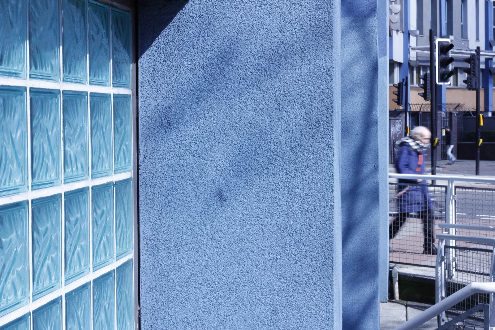

These were taken underneath the flats going over the bottom of Gloucester Rd, i liked the two different tones of blue from the square glass tiles and the pillars, the shadows have made interesting soft lines as well. The second picture was taken underneath the walk way below the buildings and i think the composition has worked well especially with the sunlight coming in from the left


This was taken just around the corner, i thought it was a good combination of a wall covered in graffiti on the right in quite a dark tone and the sunlight road on the left, the yellow lines by the pavement almost draw your eyes to the centre.


These three were taken right by a railway bridge, the first two work really well with the dark shadows on the righthand side and the light colours on the front of the house, the colour of the door and the sky are quite similar which is a good effect. The second picture is taken of the bridge going over the road and again it's worked quite well with dark shadows and bright sky and houses underneath in the background.


These three were all taken on the same street near and old style lamppost, the photo has worked so well with the lamppost between the trimmed tree branches they sit so well over the colour of the sky, the clouds give it some kind of texture.


Changes made to this picture in Photoshop Camera Raw Filter, to take the the blueness away and to give more colour.


This picture has had adjustments in the Camera Raw Filter in Photoshop, to slightly give to houses better colour and also the sky has come out, you really can see the cloud formation better.
These two were taken on the same street not to far down from the next photo, the first picture was taken of some old timber piled up outside the front of the houses, it may seem to quite a boring picture but i was drawn towards the old timber for some reason, the curve works well almost looks like it follows the road. The second picture was taken as walked up the hill, i turned around and the sun was shinning onto the terraces and the curve going down from left to lower right allows you see how its the hill.

This was taken when i was quite close to the Downs it was on the edge of a small park, i thought it made for quite an interesting picture as you have the the white box van half of which is covered in graffiti almost in the middle trees, road, path and small houses in the background. The trees help you to see the distance as they are split up at different stages.


These last four pictures were taken on the downs, i decided to shoot quite close to the water tower, i quite like the third picture the colour is slightly better and it seems a bit more of a symmetrical shot. it seems quite strange thinking that this tower is right in the middle of quite a clear space.


These last two where taken opposite the water tower face out toward the suspension bridge, its a total opposite from the previous picture, its worked nicely with the dark tree branches against the lighter sky, the only unfortunate things are is that it was taken towards the sunlight which make areas of the sky very bright between the clouds, also the fact that there's the front o the car on the lower right side but i could crop the image in Photoshop.
This is a first test copy of how the book will finally look I was able to make this with InDesign, i then printed it but not on higher quality photographic paper.


