Activity 1: Faceless portraits.
Make a series of portraits without showing a subjects face. Here we are asking you to consider your framing as well as inventive thinking. Consider how you have ‘broken the rules’, explored time and thought about framing and composition in other activities; could you use any of those approaches here? Make them intentional (i.e. no photographing strangers from a long distance with a long lens!)
Your aim for this project is to create four final images.
Research:
1. In your own words, try to define what a portrait means to you.
2. Using the Study Centre, find a book on a shelf which contains what you think could be called a photographic portrait without showing a face.
Answer the following;
• Who is the photographer? Include biographical facts and your own thoughts and feelings about their work.
• What is it about the ‘portrait’ that you’ve chosen that you find intriguing and interesting? List those things as carefully as you can.
• Try to list the ways in which your research could help you with your own portrait.
Research
There are many different types of portraits that can be taken, it could be a picture of one person looking directly at the camera in a studio and they would normally be in a position to show their facial expression and upper body extremely well. Also there will be portraits of a couple or a family for example so they can contain more than one person. They don't always need to be taken in a studio but maybe some where they live or a place that means a lot to the person or people involved. They could even be taken at a certain event, like a party, music event a celebration of some kind or maybe at a particular time in the year, to name only a few. Also they've been taken in hard times, maybe during a conflict or when something really bad has happened and the photographer wants to express this with the person or people in the picture.
Portrait photography is such a good way to capture people at times like I've mentioned and for me i like to have more of a natural feel so the subject is not told how to sit, stand or be in a particular position. Especially if the photo is taken outside whilst something is happening you can really almost imagine what they're going through weather it be a happy or sad expression they have and where and when the picture is taken. I do seem to like sometimes when the picture is taken from a bit of distance as well so you are able to see more of the person and it helps you to understand and get more from it.
Photographers for research
I will be looking at the work at John Baldessari, John Stezaker and also Don Mccullin. These three photographers have very different ways of working but their work is good to look at to almost combine the different ways they work in someway.
Don Mccullin
Don Mccullin was a photojournalist he was born in 1935 in London, he was well known war his war time photography and he took photos in London during hard times around the UK from the early 1960s. Whilst working for the Sunday Times he traveled to many different conflicts in different countries, he took many photos showing the terrible things that were happening and the effect it was having on people.
This is some work of Don Mccullin, although these picture do show the persons face i think they are such a good example of portrait photography, pictures that are taken so well and do allow you to realise what it can do to people during a conflict.

This mans expression show you how much pain and suffering he was going through during the war in his country and you don't need to have much more of his figure to allow you to read this from the picture

This picture was taken so well he's not looking directly at the camera but his expression and position says so much, it does allow you to understand and image what these people were going through.

Don Mccullin with the 5th marines 1968
You get so much from this picture, the expression on Mccullins face really does show you what he is going through and what he's seen happen. The two Marines behind him also look in quite a state, the one directly behind him was actually killed not long after it was taken.
John Stezaker
John Stezaker was a Conceptual artist, born in the UK 1948, he was at the Slade School Of Art based in London. In the early 1970s he was among the group of artists that were against the style of pop art which was very popular at this time, they would create work that was against it and i think this is shown in his work. He would use different types of images to add to his work, paintings, advertisements, different style postcards and this would create a surreal image. Solo exhibitions would rarely happen but within the last 15 years his work has been noticed again by different collectors.
Some work of John Stezaker his work is very different from Mccullins and is made by combining photographs together to almost make a collage. I really like the fact that faces are covered sometimes with pictures that resemble the shape of the head or expression, it does make you wonder what the original picture was like, it does make you almost make your own idea and story behind what is happening.

This picture was made by using an advertisement board and the man holding the glass in what could be something to do with drink company or a club of some kind. Text coming in from the top left hand corner in pale blue sits so well on top of the grey background and almost draws you towards the man.

I really like how Stezaker has made this by adding a picture of a river running through gorge, the two cliffs either side of the picture match almost exactly where the faces should be and they take the same line as what is the front of them. Faded depth of field behind the cliffs makes them stand out so well and matches really well with the original picture.

These two pictures joined together in half but on an angle from the top left side down to the bottom right hand side, it goes straight through the middle of the man on the above section who looks like he's sitting down.
John Beldassari
John Beldassari was an American conceptional artist born June 1931, his work was made from photographs that were found or some that he already had, he would combine pictures and almost make a kind of collage to create prices of work that would have a narrative. His first types of working would be in painting, printmaking, video, Photography, installation and sculpture. He now living between Santa Monica, California and Venice.

I really like how Beldassari has added parts in the image of what looks like paint that has been thrown on or dripped, orange and a pink rope around the mans chair on the bottom right. I think it works so well against the black and white and also the yellow, green and red circles around the heads are a good combination with the light blue thick lines.

This is so good how he's covered the art work with blue, yellow and red, i like how it covers over what would have been paintings or prints of some kind. he has also covered the man and two ladies heads with different colour dots again.

There is a little less coverage in this picture although he has still the different coloured dots over the heads of the men. I think it really does make each person who's looking at the picture wonder what would be their expressions and what exactly would be happening when the picture was taken
A book including a faceless portrait.
I will be looking at a the book - Fit For Heroes, photographs by Bill Brandt 1939-1943. This work by Brandt were taken for the Burnsville Village, this was to do with pictures that would show some issues relating to design, construction and location of housing and redevelopment. These would be used to show a different contrast between resident life and how they lived.


Two of Brandt's photographs the first of a family eating dinner and then a couple having something to eat with their son looking through the window, this is a great example of how different people were living you can see the clear contrast. These are not showing faceless portraits but its good to see what area he was in working in.
some examples of faceless portraits.

This a photo of a man, in what looks like is doing his laces up with one foot on the window sill. He is not facing the camera and is looking at what he's doing, it has good composition and nice light coming in through the window into the darker lefthand side, making good shadows.
- Light and shadows.
- How the man is doing something on a normal day, getting dressed.
- Good composition.

- The washing and colours of clothes makes you look at the two children.
- really interesting image with a lot to look at in the background as well.
- Very natural photo.
This picture was taken in the back yard of these children house, the young lad is repairing his bike and concentrating on what he's doing so not facing while Brandt is taking the shot. Its really good to have the little girl next to him looking into the sky and because they're right next to each other it draws you into the centre.
I like his work a lot and its totally natural just taking pictures of everyday life for people and nothing seems to be directed by him. Its an interesting way show how different people lived and photography captures this so well.
- This will help me to think about composition.
- light and darkness/time of day.
- how the person is positioned in the picture.
- if they are doing something or maybe just sat down.
My own ideas and work
For my own work i will try to have a finished piece that is similar to the work of Stezaker and Beldassari i really do like his idea of covering the faces the brightly coloured dots or marks maybe and using the way Stezaker joins pictures together will make a very interesting piece.
First development images of mine
These images were made by using cuttings from CRACK Magazine and also a pull out from a newspaper, I have tried to collect different styles of photographs and the last two have more than just one subject, they work well when there's more than one person, especially when they're facing each other like the third I've made.

i like the original picture I've added line drawings to and also a night time horizon picture but i do think i need to work more on how and where i use the free hand drawing. the added picture could be placed better as well.

I prefer this image more than the one above although i think i need to think more about the colours used in line drawing and blocking the heads of the people. bright colours still need to be used or maybe colours that stand out well against the pictures behind.
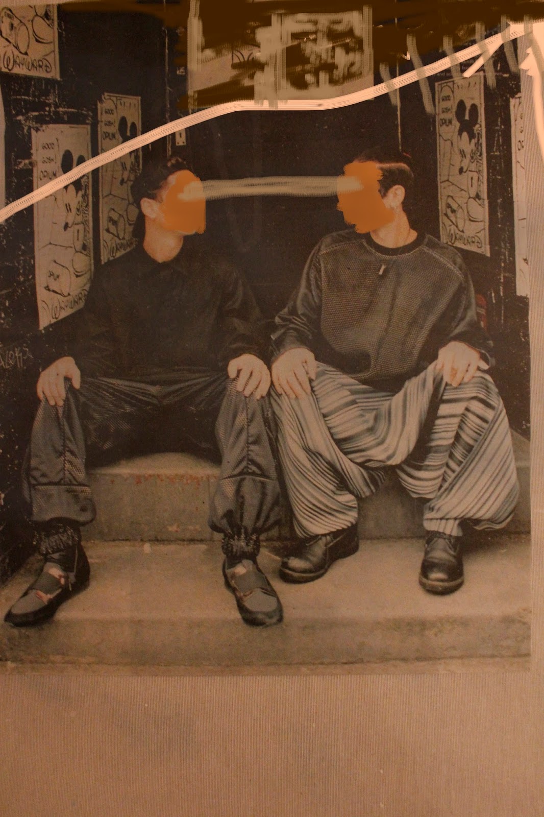
This image i like more than the two above because the colours I've sketched in with match better with the photograph I've used, the line drawn connecting they're eyes together allows you to know they are actually looking at each other. It does make you look right into the centre because of how they're sitting next to each other.

This image was made by taking a picture of a magazine page with an older couple sitting out in the garden on their lounger seat, its turned out well and I've used my own freehand sketching over it again.
Activity 2: Looking Through
Make a series of images during which you will Photograph through things. You could use sunglasses, lenses, windows, or anything with a viewing device...
The intention here to draw your attention to both the framing and distortion that can occur when you intentionally photograph though things.
You need to think in two ways here. use the lists below to plan your image.
What are you photographing through? What are you going to photograph
Think about colour, distortion, Your subject.
shape/framing opportunities
Research for photographs through things
Looking at photographs taken in this selection through glass by Saul Lieter, these pictures were taken when it was raining or cold outside causing condensation on the windows he was shooting through.

This gives such a good effect the orange and red light give a soft circular shape caused because of the condensation, where there has been what looks like something rubed on the window it gives a sharpens against the softness.

This was taken through a window in what looks like rain outside, the blue light has been distorted by the rain drops and also the white light above.


I like how this picture has worked without so much distortion to the view through the piece of glass, although there is still a slight softness and also a slight tone of orange, the text again helps for you to know its through glass and also the sharp edge of a shoulder is a good combination.
Own Pictures for development.
Here are some pictures I've taken in development for my final selection of images.

This photo is zoomed into the printed shape a bit more, it does make such an interesting highlight.

These pictures were taken from behind patio doors and it looks like this was the print of a small bird against it, it works well against the darkness in the back ground but the sunlight makes the print stand out. They were only taken with my phone and it would be good to crop out the reflection of my hand holding it.

This picture was shot in a car i was in and out through the windscreen, it creates such a nice motion blur to the hedges either side but the dashboard and hat on the left are in focus. Although it does make a really nice photograph there is nothing like material, patterns of signs or different colour glass for example.

This again was taken through a window but it was covered in condensation and it had some writing rubbed into it, i think it works well how it's caught the light that actually changes tone and colour in the centre to turquoise, you can see through the window from the lower righthand corner.

This was also taken through an old style mottled window, you can see different gradients of light and darker areas. I like how the plant and window frame and handle show although this could cropped, i do think that it would work better if it was taken through something with a clearer view and not so distorted maybe.
Final Decisions

This picture was shot through the lid of a blue glass bowl against a window, you can see the horizon but it's split apart by the shape of the lid. The light works really well with the blue glass and lighter shades of purple are show, you can see how much lighter it is where the sky is.

This was photo was shot through a green plastic water bottle, the condensation makes a nice effect, especially how it goes from larger drops on the left to smaller near the centre. You are able to see slightly better through it although it's still made quite distorted as well.
Both of these pictures were shot through an air system down by some flats at Bristol docks, the light has shone through on to the lower sections which start on the right and lefthand corner and they start to become smaller as they get further away. It works quite well how the right panel is darker and the left is a lighter tone, also the shadow in the centre helps with the depth of field and helps you to look into the centre.


Both of these photographs were taken at Wells Cathedral, they were shot in the same area looking out of small traditional windows with lead beading, i focused in on the window and beading and the view of the steeple and side of the cathedral outside are a bit out of focus and blurred. Although the view outside is a bit distorted you are still able to recognise different parts of the building as well as the trees, grass and blue sky.


I think in terms of framing it has worked quite well, the beading on the windows in the foreground has made good symmetrical shapes within the edges of the picture, lighter tones of the view outside work as a really good background to the dark beading and it does bring it right to the front.
Activity 3: Scanning Still Lifes
Task:
Explore the potential of a scanner to make photographic images; make a series of images by placing objects on a scanner.
We want you to consider carefully what you can say thorough the careful choice of objects you want to use.
Still life is a genre that has been explored extensively and richly by artists and photographers. Many still life images can be interpreted symbolically, that is, through reading the meanings and significance of the objects included. We will access list of symbols, but we also want you to think about how we all add symbolism to objects and spaces we explore in some ways.
This activity works really well when exploring flowers, leaves and other botanical features. You have a great opportunity here to explore and use the symbolism of plants and flowers. Consider too that where the flowers have come from could be symbolic. i.e. leaves from a tree near a special place, or flowers that have a special significant for you.
Activity:
Make an arrangement of objects on the scanner which explore the symbolism of the objects you
have collected.
Think portrait format or landscape format – which would suit your method of working best?
Technical considerations;
• always protect the glass of your scanner bed.
• scan at 300dpi.
Your aim for this project is to create four final images, and one final selected single image.
Please evidence the process of your work on your Experimental Imagery blog.
Discuss your project with your tutors and shoot, edit, review your images regularly on your blog to show your project development.
Research:
A Powerpoint of starting points for your research will be shown during the session.
• John Baldessari – Still Life project provides a useful list of still life symbolism relating to
paintings from the 17th century: http://in-still-life.com/learn.php
• Jessica Summers is an artist and photographer who uses a scanner extensively;
http://www.jessicasummersartist.com/
and an interview with her here;
http://www.ghosttt.com/photographer-interview-jessica-summers/
• Symbolism in plant and flowers, a list:
http://painting.about.com/cs/inspiration/a/symbolsflowers.htm
• Though a still life photographer who doesn’t use a scanner, Irving Penn is still great to look at
in terms of how the kinds of objects he photographed;
http://www.artic.edu/aic/collections/exhibitions/IrvingPennArchives/still-lifes
• In a broader context, consider how you are making photographs without a camera or a lens in
response to this activity. Have a look at: http://www.vam.ac.uk/content/articles/c/camera-less-
photography-artists/
Research: John Baldessari
The piece on the Baldessari in still life website about how different things in a still still life picture represent different things is very interesting and you can see how this has worked over time with well known paintings.
Some examples of this are:
Pocket watch - Symbolises the brevity of earthly existence
Bread - is reminiscent of the blessing of Christ, so suggests the importance of morality over ostentatious pursuits.
Knife - suggests the transience of human life.
Mouse - symbolizes decay, destruction and, hence, the inevitable passage of time
This is some of Baldessari's work, the middle piece was made in Late 1960s and the others work with parts the has added with small parts of text which give an extra message and you read into it a bit differently. 

Kissing Series: Simone. Palm Trees (Near), 1975
This looks like the girl could be leaning to kiss the top of the palm tree.

Wrong, 1966-68
This is a great piece with WRONG written underneath in the white boarder, it makes you think what is wrong with it, maybe the picture itself or for some other reason.

Bens Jacket Drapes Perfectly Over His Shoulders, 2015
This picture of the girl led out on the sun lounger is a good combination against the flat what looks like printed colour, also the colours are a totally opposite type of colour you would expect, like maybe a yellow or orange to represent the sun and hot weather.


I Saw It, 1997
Publisher: Side Street Projects, Edition of 100.
It is very minimal this image but that makes it good, especially with the piece of text, I Saw It, it makes you think is it because he had seen that object where it was or could it mean something else, when you look at the shape of it as well.
My own scans

A cassette tape, this has worked quite well with the light showing through the two tape reels in the clear rectangle in the middle, also the four small holes at the top.

Screen shot of the process with scanning the cassette
changing the document type

Reflective, Document Type

Changing the Document Type to film.

Reflective Document Type is used for scanning document and the light is reflected from what ever is put under the scanner, film document type is used when you want to scan through an item and the light goes through, the tape I've scanned in this project is an example of this, you could also use something that is quite thin but still has some kind of texture to it, maybe even material or a clear object that has a pattern or engraving on it.

This scan was done including of a box of Dutch Masters cigars and a book of matches from the Imperial Palace Casino in Los Vegas. The scan has show the graphics on the box and matches very well although i could have made a scan of something that has more texture and possibly have light passing through, similar to the tape.

This is a screen shot which is part of the process in scanning the cigars and matches.
My final choice of the scan will be the cassette tape, it does seem quite like its just the one item by itself but the way the light has come through does give a nice profile of the tape, especially with the tape wheels. I did want to use a different kind of object to scan, rather than just flowers, leaves and botanical features as explained in the brief, at tape cassette does mean a lot to me as it was what I used to play music, many years ago! It's quite something as now it seems like an old musical format, in comparison to what we have now.
Dark Room Experiments
Activity 4:
Darkroom Experiments 18.04.16 & 25.04.16
Task;
Over two sessions you will have the opportunity to initially experiment and then fine-tune your experiments to create more controlled and predictable results.
Activity;
1 Working in pairs or threes, assign the roles of flash gun operator, or tray / water agitator.
2 Working with the flash at around shoulder height, add photographic paper to the tray of
water and create splashes / ripples.
3 Try some first without the flash to visualise what kind of image might be created.
4 When you are ready, agitate the try / splash and fire the flash, co-ordinating and communicating with others in the darkroom to ensure no-one else’s work is accidentally re-exposed.
5 Process the print according to usual darkroom printing times for VC paper, that is, 2 mins developing, 30 secs stop, 2 mins+ fix, 5 mins+ in the water wash.
Technical considerations;
• if your print is too dark, hold the flash higher.
• more ripples, or more vigorous agitation works really well.
• pay attention to all health and safety information given regarding working in the darkroom with photographic chemicals.
When you have completed your images, and they are dry, make sure you scan them. Please evidence the process of your work on your Unit 32 Experimental Imagery blog.
• The link to the Susan Derges clip directly;
http://www.photoforager.com/archives/susan-derges
• Anna Atkins http://www.getty.edu/art/collection/artists/1507/anna-atkins-british-1799-1871/
In terms of planning your time, aim to complete this project for your Unit 32 Experimental Imagery blog by the beginning of May 2016.
Research;
• The Victoria and Albert Museum held a big exhibition of camera-less photographs in 2011
called Shadow Catchers. Please view the videos in the link below. Make notes and explore further
the work of any photographer’s whose work appeals to you.
http://www.vam.ac.uk/content/articles/c/camera-less-photography-arti
Research: Susan Derges
Susan Derges began as a painter before concentrating her work on photography, she worked a lot with the technique of making picture but without a camera. By working so much using this method she became so well known and became the innovator of camera less photography.
I think these pictures of hers you really can see, with the composition how she would have looked at certain things with the eye of a painter, for me this definitely shows in the second picture, Ebbous Moon, but also with the other two as well, comparing them to abstract or minimal paintings in some way.

River Taw Ice, 3.2.97
This is the piece of her work that I thought was similar to that of a minimalist piece of art, the slight different tones are amazing and the cracks of the ice sit so well on top. The line near bottom from left to right looks like it could be a moulding or a rail on a wall and the cracks could be paint or paper falling off.

Ebbous Moon, 2009

Full Circle, 1992
This piece of Susan's work is exactly the same as we will be trying, the dark shadow in the middle of the water ripple looks like it could be some kind of creature, the white highlights have come out so well.
Our own work
I worked with Shen and he was splashing the water in the tray while I was holding the flash about 5-6 inches above, we filled the instructions to allow us to create a developed image.
Our first attempts came out reasonable well and did give quite a nice final picture. Bit on the last attempt we did decide to make slightly more movement in the water, splashing it more for a longer to try and make a final piece that could show more movement in the water.
This did work very well and it makes such a good effect with the darker areas that are the shadows/lower parts of the water and the really light tones which must be the areas that ar closer to the flash.

First picture

Second picture
Although the first two are quite simple and have more subtle shapes with smaller movement of the water they still make such a good effect, you can tell that it is water especially with the first, I like how there seems to be a bit of a shadow at the top of both of them.

Third picture
You can see clearly how much more movement there is in our third picture, it has made so many different types of shapes some of which are quite simple and the circle area in the middle lower section has really small parts all joined together, the whole piece looks like it could be some dye on fabric.
You could possibly use objects or from what I've looked at in my research you can use this technique outside, mainly at night which would give the effect of a darkroom as it is dark.
Evaluation of this Unit.
This unit has been a really good way of making you look at things in a different way, in terms of what you are actually shooting for a picture but also what you can do to the photograph after you've taken it. It really has helped us to think about what certain settings that need to be used to get particular pictures when you are trying to focus on a subject that would be quite different, especially the project of Looking Through Things, which I thought was great.
Working on images that aren't actually photographs that you've taken yourself and adding or editing blocks of colour and even freehand line drawing which I have done. It does give style to the work that would be your own and people would begin to recognise this.
The work we did in the dark room was another really good project, it's actually unbelievable what you can create even without a camera and it gives a fantastic effect which could be used for so many different projects you have yourself.
No comments:
Post a Comment