Unit Evidence Assignment
This unit has seven projects associated with it.
THIS S A REMOTE TEACHING UNIT AND WILL BE DELIVERED VIA MOODLE. Assignment You will need to successfully complete the following projects.
It is important to know how some digital artists create their work; this can often influence and inspire others to create work of their own. Following direction provided you are to:
Produce a 800 word illustrated article on two digital photographers of your choice, who’s work explores Photoshop manipulation techniques. You can choose from these artists if you so wish.
- Bogdan Zwir
- Christophe Huet
- Joan Charmant
Using your own images and Photoshop you are to complete five of the seven following techniques:.
For each project Use the Tutorials that are posted on Moodle, One will be posted each week (sometimes 2 will be posted) and you should aim to finish each project by the following week and have evidence of working pattern (Screen Grabs and annotation) on your Image Manipulation Blog as well, as your final finished image, and a completed evaluation of the process.
The final (8th) assignment will be posted 29th Feb 2016 and the unit deadline is 16th March 2016
- An image showing a ‘professional’ level of vignetting.
- An airbrushed portrait.
- An image where you have ‘changed’ the weather.
- An image showing the effect of ‘Lens Tilt Shift’.
- A Victorian hand coloured print.
- A Hockney Joiner for cheats.
- Paul M Smith Manipulation.
- Series of screen grabs, annotated on your blog, showing how you carried out the Photoshop techniques necessary to produce your image/s.
- An evaluation of each project (weekly)
- Final evaluation of the whole units work.
NOTE: Your final assignment image Paul M Smith should be printed as a photo quality A4 print.
An 800 word illustrated article on two digital photographers
These are the two digital photographers that I've chosen to look at and write an illustrated article on
Jeff Wall

This is an amazing photograph in which Wall has taken a portrait of himself but he is in the picture twice in two completely different positions and clothes, looking in different directions. It really does make you wonder how he has managed to do this and there seems to no areas which enable you to understand how it was possible. I think that it could well have been done by using photoshop to crop two individual pictures and join them together, this would be possible to do.

This piece was named, The Invisible Man. It is taken in such an interesting room where there is so much to look at and is so interesting, the countless amount of lightbulbs on the ceiling come down to different levels as well.

The idea behind this photograph was his recreation of Manets, Un bar aux Foiles Bergere, in terms of composition it's so similar and also how the light is shown as well, but it's obviously a lot different than a painting that was done in 1889. I think something would've been done with the back ground tone in some way as the foreground is quite sharp.
The first picture does seem to be the most minimal the corner of the room where the two figures are stood helps to bring them to front, the sofa and white chair help you to see the depth of the room. in comparison the two other photographs have lot more objects, light and depth although they do draw your eye in a similar way, all three do seem to have the same way bringing you into the centre. The Invisible Man works so well and the lightbulbs on the ceiling create such good texture, how some of them are lit and others not this really does help.
Rick Doble

This is such a good experimental picture, it almost looks like it could be a painting but when you look closer you can see parts where allowing you to see that its a photograph that has quite possibly had something done with it in photoshop, i think that it could have been taken with a long exposure. Some of Doble's work was inspired by Cartier Bresson

This is very to the photo above, it was taken at an event where people were dancing which makes a really good blurred effect but you can also see there movement. The colour in this picture is split up by different tones and there does seem to be a light area in the centre.

Being taken at night really does show the traces from the traffic so well, the reflection in the water on the road help to make more of abstract picture also the combination between slightly blurred and sharper traces is a good mixture. In this picture i think something would've been done with tones and possibly exposure levels.
All three of these photographs do have the effect of making you think they could almost be paintings, the first does almost look like it could be impressionist and the other two do like they are a lot more abstract pieces of art. the last picture taken of traffic during the night is a lot different but it gives an amazing effect with the light traces from the car lights which draw your eyes into the centre. the first and second picture do use lighter tones as a background and darker shades of what looks like figures to the front which is completely different from the last.
My own Andy Warhol poster project.
Project 1
Warhol Poster.
For this project you need to create a Warhol style poster of a portrait that you have shot.
It is best to shoot close up tight head and shoulders only. Try to use a white background (or at least a neutral colour.
Research of Warhol Poster
These are some of Andy Warhols prints that were done in the early 1980s, even though they were done in the early 80s they could still be used today, in some ways it makes you think that his work was ahead of its time. Its not to over the top and it does have a simple look although the use of colour is done very well and it really does draw you into it. all of his work was created using screen printing but it also is done os that it gives a free hand style to it.
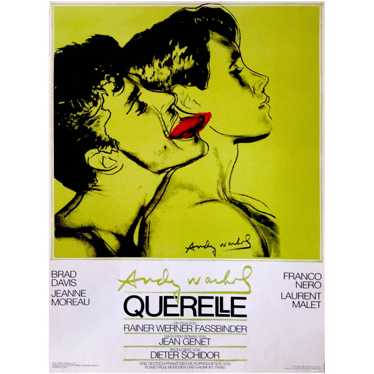
German Pop Period Movie Poster for Querelle (Green) by Andy Warhol, 1982
Although this movie poster has only three colours, it still makes a brilliant image and the outlines around they're heads and shoulders almost look like it could've have been a drawing when you look at it from a distance.

Perrier Andy Warhol perrier 1983 synthetic polymer paint and silk screen ink on canvas
This has a good combination of colour, the light blue in the middle does bring the Perrier bottle to the front away from the pink canvas although the green and darker blue above almost look like they're on the same level.

Gun, c.1981-82 (black, white, red on pink) · Andy Warhol
This is nice how he's used the different colours to create depth, white at the back and then the black right in the foreground, also how the gun is slanted down as each print is made this helps give this effect very well. I Like the use of the different colours and how you are able to make the image stand out so well.
add some kind of screen shots
My own Andy Warhol Poster

This is my version of the Andy Warhol style portrait, I was able to make this by using photoshop. The colours are light tones but they still are really vibrant and I did put the white version in the middle.
Evaluation
This was really good to know how you can create this style similar to the posters of Andy Warhol, I would like to create something that is similar to that of the two first images that I looked at for my research as I really like the hand drawn look to the image, It would be good to actually use my own art work on top pictures I've taken.
TILT SHIFT IN PHOTOSHOP CS5
IMAGE SELECTION
When choosing a photograph for the tilt-shift effect, bear in mind that you want to give the impression of a miniature model. Miniature models are usually viewed from above so try and choose a photo with an elevated viewpoint. Buildings, roads, traffic and railways are excellent choices but make sure there is a reasonable wide angle of view.
1. Always start by working on a copy layer. Command (Apple Key) and J
Once you have Opened the image in Photoshop and copied the layer enter Quick Mask Mode by pressing Q on the keyboard, or select the Quick Mask icon as shown in the Tool Palette below:
3 THE GRADIENT TOOL
Choose the Gradient Tool by pressing G on the keyboard, or select the Gradient Tool icon. Be sure to choose the Reflected Gradient option (the fourth icon along before the Mode drop-down).
4 DRAW A LINE
Draw a vertical line; the start point will be the centre of the in-focus area, and the end will be where the transition from in-focus to out-of-focus is completed. This step, and the subsequent two steps, will need a fair degree of trial and error.
5. VIEW MASK AREA
Before progressing, review the position of the red mask. The middle of the mask is where the in-focus area will be, gradually losing focus towards the edges. Note the out-of-focus effect is yet to be applied.
6. RETURN TO STANDARD MODE
Press Q on the keyboard to exit Quick Mask Mode and return to Standard Mode, or press the icon on the Tool Palette as shown below. The area to apply the focus effect to will be surrounded by the "marching ants" selection lines:
7. LENS BLUR
Choose Filter > Blur > Lens Blur:
8. REVIEW AFFECT AND TWEAK SETTINGS
Hopefully, you will now see a pleasing focus effect. The Photoshop default settings for Lens Blur seem to work well, but experiment with them to improve the effect. If you are unhappy with the position of the focus area, go back to Step 4 and try drawing a line in a different place or with a different centre of focus.
9. EXIT LENS BLUR INTERFACE
Assuming you were happy with the image preview in Step 8, click OK to accept the settings then Press CTRL-D on the keyboard to remove the "marching ants" selection boundary
10. OPEN HUE/SATURATION INTERFACE
You may want to boost the colour saturation, to improve the effect. Remember that model scenery is often brightly painted so enhancing the saturation helps trick the eye. Press CTRL-U on the keyboard or select Image > Adjustments > Hue/Saturation: Try adjustments of about +40 saturation,
it’s intuitive so see what it looks like.
11. OPEN CURVES ADJUSMENTS
It may help to increase the contrast of the image slightly using the Curves adjustment. Press CTRL-M on the keyboard or select Image > Adjustments > Curves:
Click once on the centre of the curve line to lock it, and then between the centre and top right just slightly bend the top half of the curve line slightly up and left. Take care not to overdo this, your image may not need the contrast adjusting at all and if it does it will only need a slight tweak.
If you are happy then File Save as.
Some research
Here are some great examples of the tilt shift style, especially when traffic or maybe people are walking in the street are included.

Shawn S Idle
The bright colours work so well against the lighter tone of the street, different colour tones help to break the picture up well.


This really is an amazing photo using this technique so well, it does give the illusion that it is almost a small model, the smoke and the building just to the right does make you think it's small.

The background in this picture has a good blur to it, which is part of how make this technique work so you don't have a great DOF, the lighting in the foreground is slightly brighter so it does bring it right to the front, although the light of the city in the background to give a great depth to picture.
My Own Pictures i have worked with
My own pictures that were taken from the top of two multi story carparks in Bristol, i thought it would work to get a good picture with an elevated viewpoint, showing buildings traffic and have fairly good wide angle of view.
Possible extra images


I think the first image and the last have come out quite well although the focal line needs to be placed in better, the middle picture needs slightly more blur either side of the focal point.


Evaluation
The pictures i looked at for my research are amazing, the Fire picture in what looks like New York really does show how this style works so well, the light shown in the the night sky in the last picture I looked at gives it a whole different effect in combination with the street lights in the foreground as well. I found it reasonably easy to follow the instructions for Photoshop and there are many different ways and pictures you could use this, although you do need to be at quite a high spot to shoot the picture.
Hockney joiners (The Cheater’s Way.)
David Hockney made a series of images in what is now termed “Hockney Joiners”, by simply taking many images of the same subject and surrounding area and simply joining them together in a montage. The process has been copied and repeated many times in the name of art.
This is my version of the "Hockney joiner" I'm really the happy with the final picture that I've made using the tutorial video that I followed. I decided that when splitting the squares up, I wouldn't mix them up to much so you are still able to see the shape of his face and it doesn't make it to abstract. It has still worked well as you can see the shadow of the each underlying square which makes a great effect, this is done by changing the opacity of the layer.
It was such a good picture to use for this especially with his tooth cap saying R Z A right in the middle.
It was such a good picture to use for this especially with his tooth cap saying R Z A right in the middle.

Screen Shots from Photoshop follow the different stages.


Splitting the image up into a 25 square grid to allow you split in apart.


It did make it a lot easier and quicker to use the actions box to repeat the same thing when selecting each square selection.


This was great to actually start moving the different square selections around and trying to decide where you wanted them to be.


Evaluation
I thought this was a good project and it really does make you realise how much you can do with Photoshop to change, alter and edit a photograph after you've taken it. It can take a bit of time when you're trying these different processes for the first time but it won't take long to get used to it and you're able to do it no problem.
Airbrushing a portrait
This is the airbrushed photograph i have airbrushed the first picture is the original before i made the airbrushing adjustments.

Screen shots of the airbrushing process in photoshop
the first steps with the helming brush.


You can see in the second image how some of the small lines on the right side of the mouth have been blended into the skin.

This was the part where i removed lines around the neck .

It works so well how it can be removed and totally blended in without anyway of noticing any airbrushing at all.


Here you can see the difference around both eyes and the small wrinkles have been blended into the skin.


I did spend quite a while brushing over small wrinkles around the face.

this is the part of Gaussian blur to soften the skin.

Using the small window to see the difference with Radius percentage.
At this point i did flatten the image, which combines all of the layers turning it into one single layer.
Final image after all the airbrushing has been done

I think it was a a really good way to edit a photograph, especially if you are taking a portrait shot for a customer, you can remove pretty much anything even if there has been dust on the lens or a mark on the subjects face.
Evaluation
I thought this was quite a long process and you really do need to be very careful when airbrushing the image although the outcome works so well, it does make you realise how much this must be used in advertising for well known clothing companies, especially for large billboards, magazines and also newspapers
Vignetting an image on Photoshop

This is the image of a car, an old American classic pickup that I've chosen to work with on Photoshop, i think the effect I've chosen has worked quite well, its really brought the red of the car to the front, I also watched the video tutorial which helped very much.
Screen shots from Photoshop whilst creating the Vignetting effect.

First stage copying another layer.

Selecting the Transform selection.

Effects and Colour Overlay within the section I made.

This was the image once I was happy with it.
Second car picture

This was a second image that I used to put the vignetting effect to, I think it's worked slightly better as i've managed to put more of a shape that goes around the very small car with the UPVC roof. I did also put an outer glow around the selection which has made it stand out a lot more.
Screen shots for the scened image

copy the layer to work on


Select the transform tool to mark out the area i want to work in

use the FX bar below the layers section to adjust the colours, make them brighter in the area I've chosen.

This is where I've added an outer glow to make the area stand out a bit more.

Another style added to this.

There is a stroke added so it give a kind of drop shadow inside the transformation selection
Screen shot to show how it was done.

I think with the stroke it does give the area around the car a better way of separating it from the original picture, it stands out a lot more.
Evaluation
I thought that this is a good effect to know how to use, it really does look like it could be from a postcard or even some kind of promotional leaflet for a product of some kind, I did think it was quite easy to follow and it could be used for many different things also you could change certain parts of it to make it more subtle.
Victorian Hand Coloured Print

Original picture as it was taken at a reclamation place near Glastonbury, it's a nice collection of old post boxes although they do have the price labels tied to them.
Photograph after going through the process on Photoshop

This is my version of the victorian hand coloured print that I managed to make using Photoshop, with help from the video tutorial.
Its worked well and I chose to keep three of the red post boxes two of the green, also two lamps the timber post they're attached to on the right in the original colour, it really does make them stand out well
screen shots taken from Photoshop creating the Hand Coloured Print effect.

First creating a copy of the layer and adding a vector mask


Working on the vector mask and selecting Basic Brushes, a size 65 soft brush and the painting around areas i would like to have a slight deeper colour.


Changing the levels and lowering the tone of the areas I had brushed


After changing the colour levels on the layer section and not the Vector Mask it does bing back the background colour but not to much, it gives a slight yellowness as well which does give it quite an aged effect.
Evaluation
This was quite easy to follow after watching the tutorial I found it to be a style you can give to a photograph you have taken it that actually doesn't take to much time to apply, I was reasonably happy with the final image but it would be good to spend a bit more time, after watching the tutorial it works so well when you are shooting a couple or a group posing with a nice background
Create a Paul M Smith Style Image
A tripod is a necessity.
Your camera.
Planning.
Try to create a scene where you are interacting with yourself, don’t be worried about being surreal your image, it may be an enigma but it will raise questions.
For your final image make the effort to at least change clothes for each shot, looking different in each image creates a more realistic scene.
Try to choose a location and/or day that will cause no lighting problems, for instance if you shoot on a day that the light is constantly changing (ie sun behind clouds or heavy/light cloud cover) then your images will not match in light and colour. Indoors will be ok but remember to set your White balance accordingly.
It is important that you use a tripod for this exercise, you need to mount your camera on your tripod.
Remember to not move the camera once you have started shooting.
Your camera needs to set either on to manual mode or on to Aperture priority.
Shoot at a small aperture (F8 to F22) so that everything or person will be in focus.
The aperture setting needs to stay the same for each of your images. Your camera needs to be set on Manual Focus.
If you move closer or farther away then be sure to re-focus your image to focus on you.
ONCE YOU HAVE YOUR IMAGES, THEN SEE VIDEO TUTORIAL ON HOW TO CREATE YOUR FINAL PAUL M SMITH IMAGE IN PHOTOSHOP.
Research into Paul M Smith.


British Telecom (Agency: St Lukes)

This is a really good picture of four of himself having a good few drinks at the pub or club, in some ways when you first look at it, it looks normal until you go round each person and realise it's all him.
My own Paul M Smith Styled Image.


SCREEN SHOTS FROM PHOTOSHOP


Paul started by actually studying fine art at university in the early 1990s and after completing his degree he then decided to carry on with a masters degree in photography, during this he was looking into the meaning and area of masculinity and focusing on the dominant male identities and you can definitely see this in some of his work. He has used the technique of making a picture of different people all with his own face, he is well known for the cover of the Robbie Williams album cover which is a picture of a football match celebration at the end of the game all with Robbie's head on different bodies, in different positions and with different facial expressions.

Robbie Williams album cover.
It really must have been so much work to create this, maybe he's just added the heads to other peoples bodies in some way.

Artist Rifles
This has worked so well and it has ten of him in the picture, it really does make you wonder how long it would have taken to actually create this especially without the camera moving as well.

I think this is for some kind of advertisement and its really clever how he's managed to join the three pictures together, with people handing the product to each other.

Make My Night
This is a really good picture of four of himself having a good few drinks at the pub or club, in some ways when you first look at it, it looks normal until you go round each person and realise it's all him.
My own Paul M Smith Styled Image.
My idea for the Paul M Smith styled image was to create a group of people in the kitchen who are about to start cooking something, all of those people will be me though. In some ways i wanted it to be something that would normally happen everyday, I'm not sure if there'll be much sign of talking but maybe eye contact like something is about to said. It should work quite well because it's quite a small space and you'll be able to see there's quite a lot happening. I will have to make sure that I'm stood in different places all around the room so I'm not directly in front of myself and i'll try to make it look as natural as possible so it's not to posed, it might be quite hard using the process on photoshop but I'm willing to give it go and see how it turns out.
This was the final image after I had edited it on Photoshop.

I'm really pleased with how it's turned out and I think I've managed to position myself well in each photograph, I am bent down opening the fridge but you're still able to see me opening the window and putting the pan on the hob, I've positioned myself to the right and left which helps with the composition, it also looks we're about to talk as well.
These were the individual pictures that I took before editing on Photoshop


This picture has slightly less warmth in colour it may have been because of the sunlight outside.

This picture when I'm opening the fridge door has a bit more warmth to the colour, its not because of the light in the fridge though..

This picture is similar to the one where I'm at the hob and has less warmth to the colour.
SCREEN SHOTS FROM PHOTOSHOP
These were shots that I took during the process in Photoshop.


This was using the eraser tool to add myself to the first picture.


I did have to be quiet when adding the window opening shot as I didn't want to go over myself opening the fridge.


I did adjust Brightness and contrast at the end as some pictures of myself were darker in certain areas, like the far left as I'm walking through the door for example.


This was the option merge visible the image after the last picture was added after using the eraser tool.
Evaluation
I thought this was a another great project helping us to understand and become familiar with one of the many different processes you are able to use on photoshop, It really does create such an amazing effect, you could possibly use this in a larger room or space and even use two peoples faces within a large group. It does make you understand that it can take a long period of time and how careful and precise you have to be with the camera.
No comments:
Post a Comment